Brandon Consultants are a Manchester based creative design agency, specialising in brand strategy, design and innovation. We were tasked with helping to optimise the internal branding of their office space in Manchester.
The Brandon office, located in the centre of Wilmslow, is designed to provide a comfortable, creative and fun work environment for their highly experienced team of designers. The ground floor of the building was already an inspiring work-space, incorporating a reclaimed school gym floor, a comfortable seating area with all the latest design periodicals to hand and an extensive library of graphic design and branding publications. Adjacent to the shared space is a boardroom separated by floor to ceiling glazing with a large glass door, as well as a separate brainstorming area named ‘The Think Tank’, also separated by floor to ceiling glass windows.
This wasn’t one of those ‘blank canvas’ type of projects, where we’re asked to come up with ideas and design styles in keeping with the customers branding. Our brief was to supply and install graphics on the glazing to the boardroom and the ‘Think Tank’, as well as wall graphics in the ground floor hallway and some more graphics on the front windows.
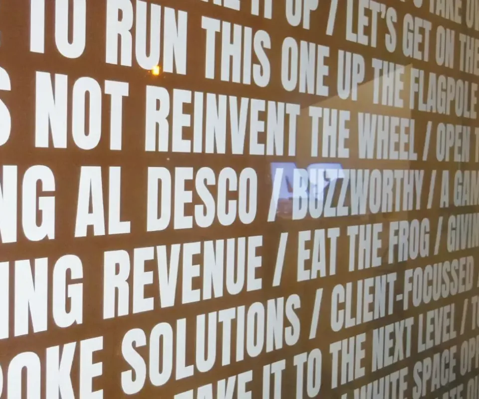
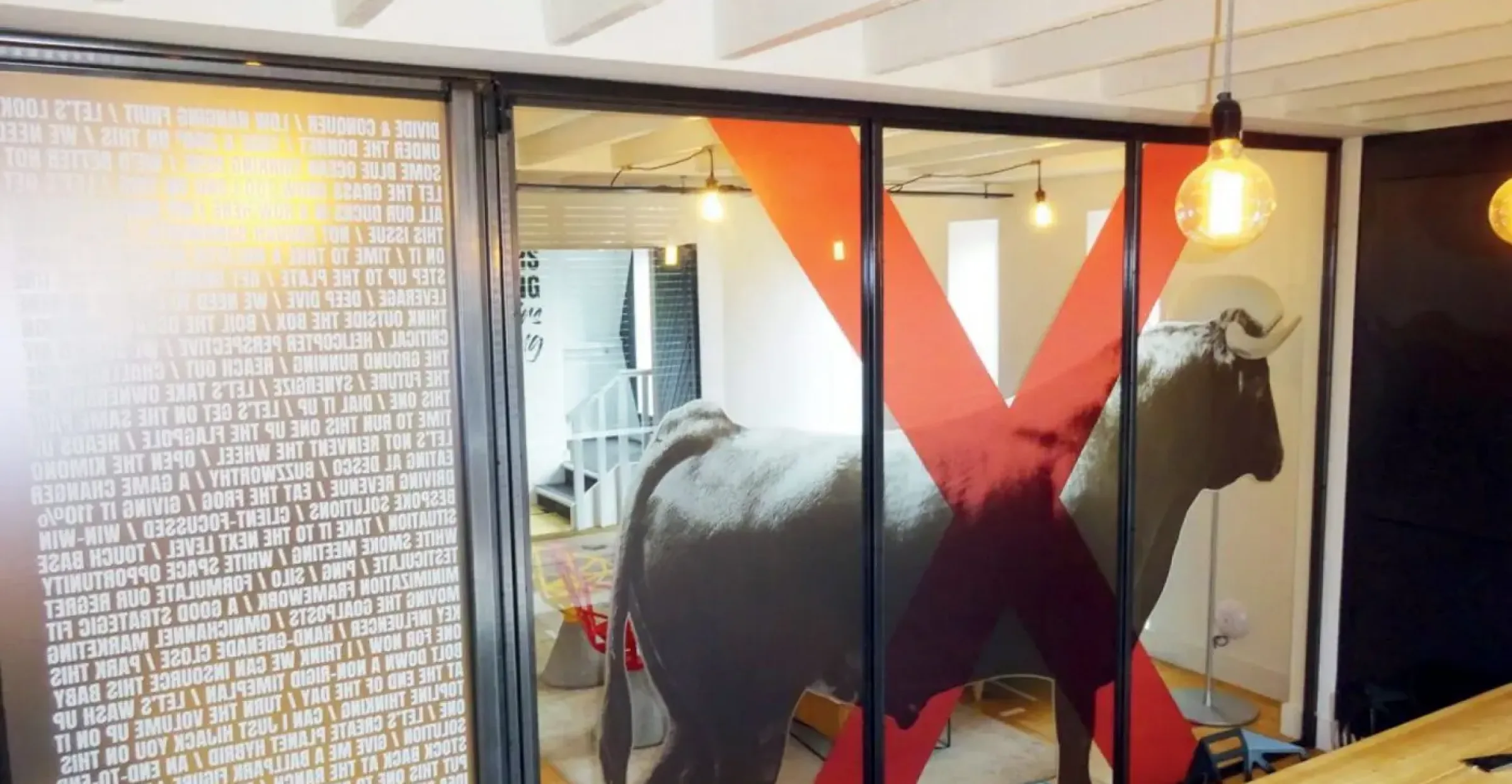
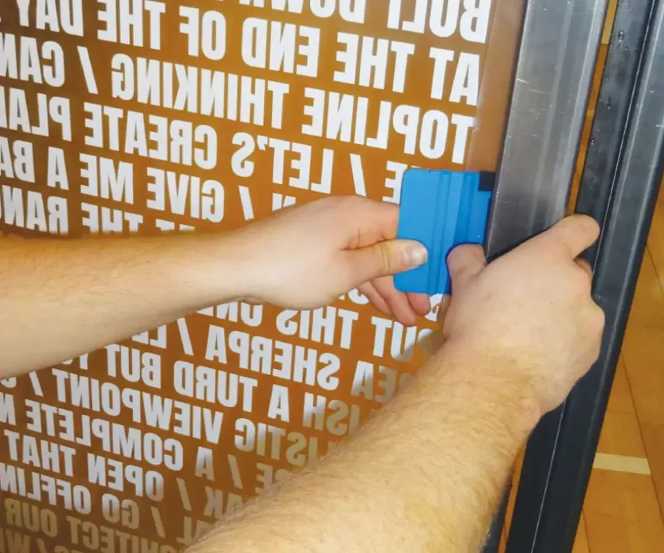
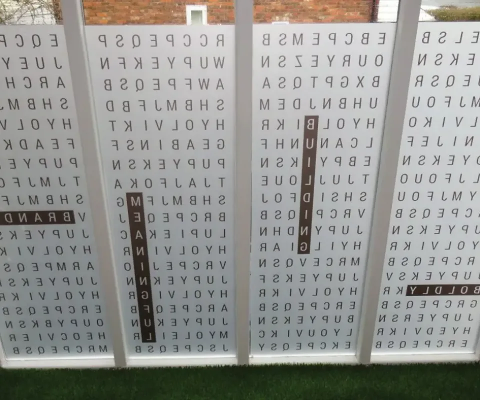
The theory behind the design here is that within the boardroom there is a ‘no bull*£$!’ policy in place, hence a rather large bull graphic, marked with a giant red cross. Initially this was going to be a translucent reverse- printed image installed onto the inside of the glass, but after bouncing some ideas between Brandon and ourselves, we decided that placing the image of the bull on the inside of the room, with an opaque red cross installed on the outside of the glass would look particularly effective. We also incorporated a full coverage graphic on the glass door to the boardroom, a typographical image containing all the marketing slogans and jargon that should never, (repeat NEVER!) be used within the boardroom.
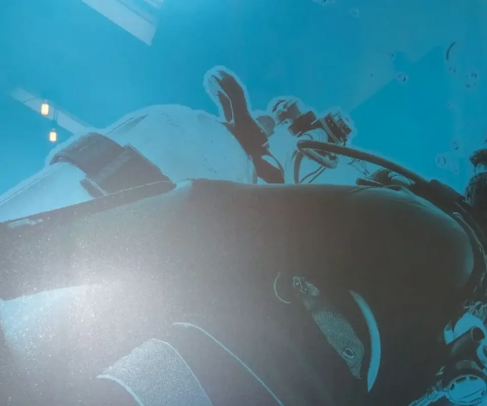
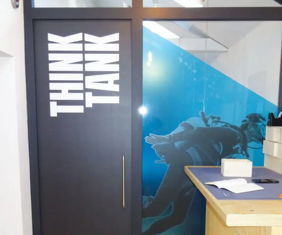
This is an area to ‘Immerse yourself in your creative thinking’. Similarly to the boardroom, we decided to install a deep blue, semi-translucent ‘sea’ on the inside of the glazing, with an opaque image of a scuba diver on the outside. This gave a layered feel to the graphic, with the diver appearing to be submerged. It looked so realistic that as we were installing it, one of the staff members thought we’d left a bubble under the vinyl, not realising it was part of the scuba diver image! We also included a matt black door wrap, with some striking white text.
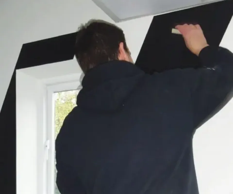
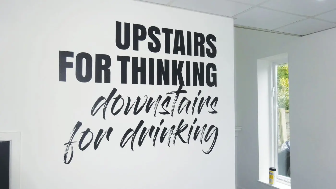
In the entrance hallway, which was painted white, we fitted some large matt black chevrons directing people up the stairs along with a simple, but effective wall graphic, again in matt black, with the slogan ‘Upstairs for thinking, downstairs for drinking’. Alongside the entrance area wall graphic, we installed a frosted vinyl graphic using Brandon’s logo. We didn’t realise it at the time, but when the sun shines brightly outside the image is perfectly projected up the stairs
Anna Tappenden, Chief Executive
The binary Projects were very professional in their approach, from the initial consultation, right through to the installation of all the vinyls. The guys brought a genuine sense of enthusiasm to the job, seeming to be as excited as us, to bring our designs to fruition. All in all I can’t fault the service we received, and we are delighted with the end result.

Fancy a chat?
If youre looking to get your project off the ground, then our team would love to help. Either drop us an email, give us a call or feel free to book in a showroom tour and we would be happy to talk about the art of what’s possible with you.
Contact Us